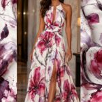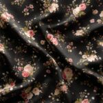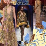
Colors and Prints
The colors and prints that are in trend for SS 21/22 can be seen below
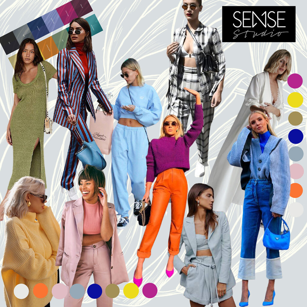
Colors are a powerful tool used to stimulate the senses and create a connection with the consumer.
Colors
The colors chosen for next year's hottest season were inspired by everyday elements and situations in our lives.
They are colors that highlight the emotions and simple sensations of everyday life, rescue the accessible pleasures in this new normal and stimulate mood.
Orchid Flower
It is a strong and imposing color, with a touch of sweetness and everything to do with people's desires. It will be present in the next seasons and brings a joyous and sensual force to the summer. It's an intense, energizing hue that promises to be featured on runways around the world.
In combinations with other colors from the Spring/Summer 21/22 palette, Orchid Flower will impose these sensations due to its intensity and visual highlight.
Butter
Butter yellow is very versatile, from the lightest tones to the most intense. The most delicate shades of yellow convey a feeling of familiarity, comfort and calm. Due to its versatility, it is very present in collections of diverse profiles. From luxury fashion, passing through casual fashion, formal fashion and also fits very well in children's fashion.
Olive Oil
Olive Oil, despite being a standout color in the palette, is the right color to produce the timeless models in this collection.
It's a more neutral color and vibrates balance and invigorating energy. For these qualities, it can also be considered as a complementary color.
Its neutral tone allows the models to have a long life and versatility to combine with pieces of the next seasons, including models from the winter collections.
Mango Sorbet
Of all the colors of the season, this is the color with the most genuine summer identity.
Mango sorbet is the color of this tropical fruit, with a sweet and exotic flavor as striking as the strength of its orange-yellow color.
This color brings joy and extroversion to the season's palettes. Adding jovial energy to models, and stimulating well-being and joy, mango yellow comes with everything.
Atlantic Blue
Atlantic Blue is related to sustainability in the production process, and collections made with upcycling. Very important concepts these days. This is the color that best represents the desires for peace and harmony.
Candy Fresh
Candy colors are still a good bet for Spring/Summer 21/22.
In addition to bringing a feeling of calm and tranquility, these colors bring a modern and youthful look to the compositions. Futuristic textures and cams are popping a lot with these fresh tones.
The touch of neon and vibrant colors in the abstract prints transform the product mix.
Vibrant Saturated
The saturated color chart is the face of summer. With a bold design in modern pieces, this color chart allows boldness and style in the compositions.
Impact Naturals
These are colors that have a place in collections for different seasons and are also necessary as a counterpoint to all the other colors in the palette.
It is worth remembering that the strength of these colors is also in the connection with the sensations of tradition and ancestry, which meet the desires for safety and sustainability, which are also among the main behavioral trends identified.