Follow the colors that are featured in the latest fashion shows ?
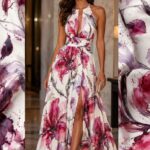
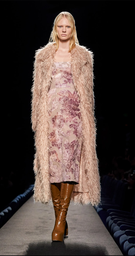
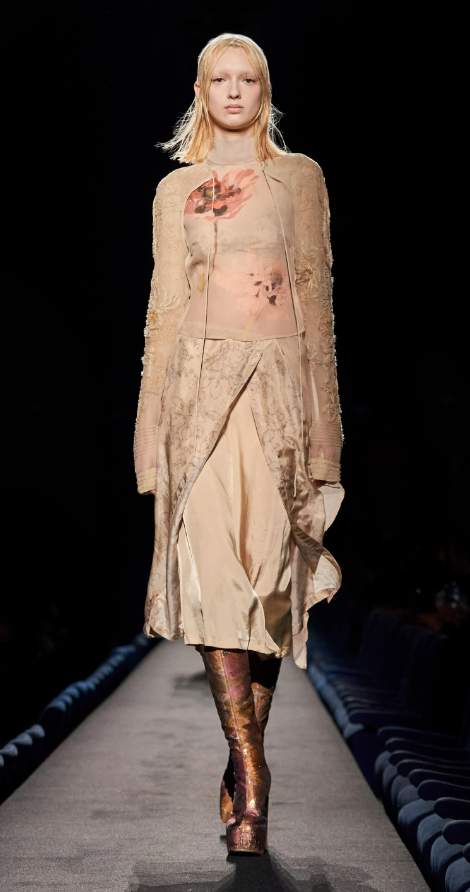
BLUSH – This first color is already used a lot in everyday life through makeup. It's that light pink tone used to give a little more color to the skin, pulled towards coral pink. In terms of prints, although this is not a rule, this shade combines better with more delicate prints, such as floral, geometric and ethnic prints. In the prints, it allows a mix of shades of the same color, that is, elements of a darker coral superimposed on a background of lighter coral, which, by the way, is super sweet.

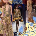
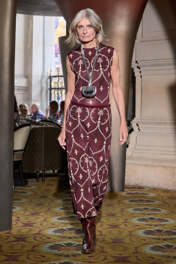
Dries Van Noten Collection
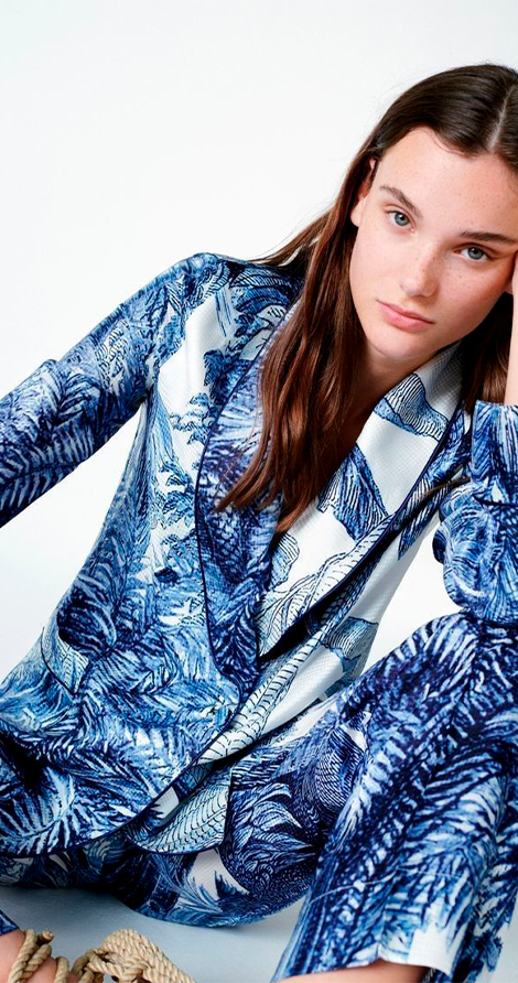
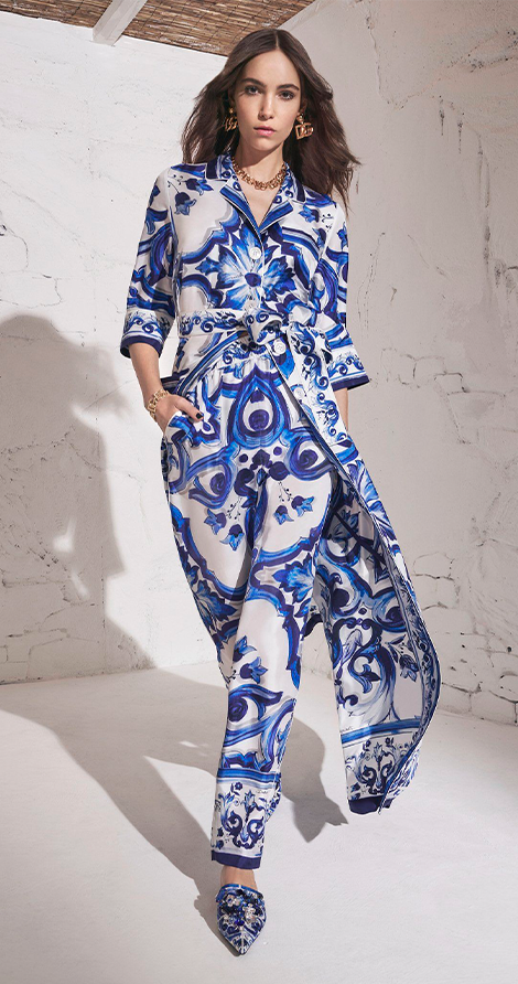
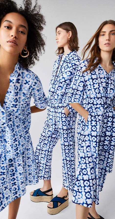
INDIGO DREAM – This second color option has a darker shade that reminds us of a combination between blue and violet. It is a variation of blue that is related to energy and consequently brings intensity and liveliness to the look or environment that receives the print with that color. It is a very similar shade to indigo. It is worth noting that as it is a dark color, it combines very well with other shades of blue, as well as being combined with grey, yellow, white, brown or earthy tones in general, and in some cases also with green and orange.
PEACOCK – In turn, this shade of color is inspired by the natural pigmentation of nature. As well, it is an artistic mixture of proportions between the blue and green pigmentation, making it almost “turquoise” in appearance and which reminds us a lot of the peacock animal.


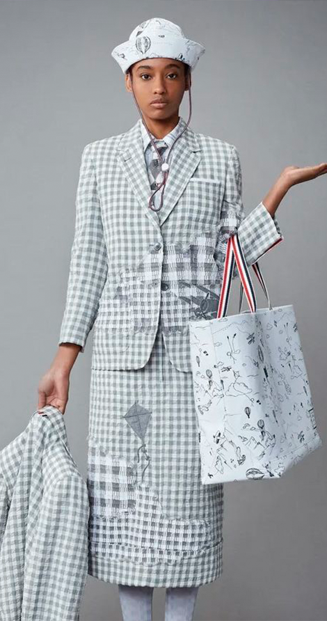
Issey Miyake Collection
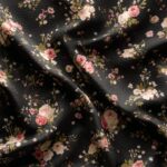
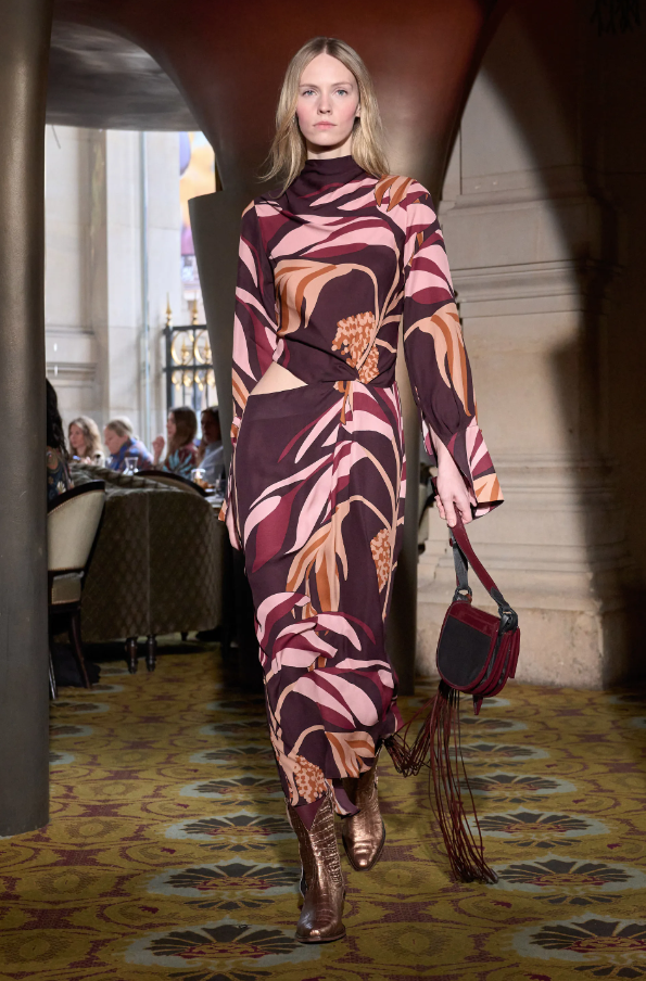
RUBY PORT – The color in question is a combination of elegance and seriousness. They are dark shades of red, which remind us of vineyards. They combine well with earthy tones, light pink and orange.

SHADES OF GREY – This card is for those people who like more discreet colors. They are colors with grayish and matte tones, which consequently combine well with night looks.

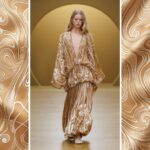
WHEAT – This color is a shade of burnt greenish yellow, which reminds us a lot of the color of straw because it is more matte and as the translation of the name already says, it also reminds us of the color of wheat. Prints with this coloring are usually more delicate and rustic, as it proposes the idea of ??a farm/field.

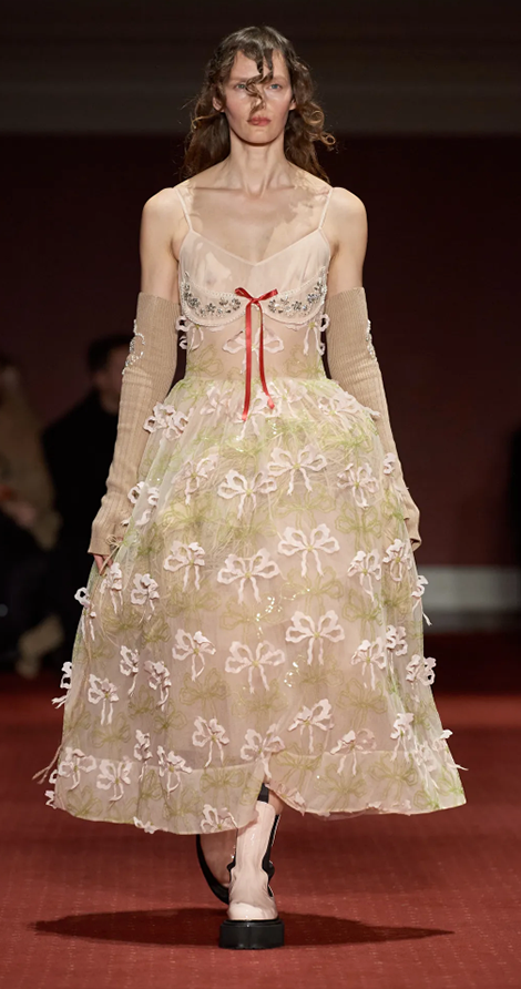

Simone Rocha Collection
Did you like it? In our catalog we have exclusive prints with all these colors ?
Visit our website and request access ?